Arnie and I were going through images today, making selections for some juried shows. I don’t know about you, but it takes time to do this, and with our busy schedule, shows often get passed by because we’re on the road or catching up with work that has accumulated while we were away on a workshop. This year, however, I have made a commitment to try to enter all the appropriate ones possible. No, we’re not talking dozens, but there are some that carry a lot more merit, a certain cachet, than others — ones into which we’ve been juried before and into which we’d like to be juried again.
This particular show is dedicated to black-and-white images, and Arnie’s first love is black and white, to wit his work in LIFE and Time and a whole slew of other journals. I started out at age eight in black and white film, but I didn’t have a darkroom, and the film went off to who-knows-where to be developed, probably the local Rexall Drug Store. Arnie, on the other hand, at age 12, joined his cousin in his darkroom, and it became a life-long fascination with the nuances of what today in the digital darkroom is sometimes called grayscale.
 I always loved color, albeit often monochromatic versions, so I always trust Arnie to have an eye for the ins and outs of black and white.
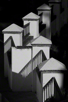
As we perused my potential selections, he agreed that this image was perfect for conversion into black and white. It had the range of tonality to work.
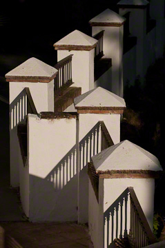
It was another another one-shot deal. The early morning light was changing rapidly in a small village outside Ronda in the white towns of Andalucia, those famous pueblos blancos.
We were working with our participants, encouraging them to look for patterns and dramatic light.
In a brief lull, I was standing on a bridge, watching some of our group and observing the light. I kept turning around, and the image here is what I saw. Even as I watched, the light changed subtly, but dramatically enough for the discerning eye, and I waited for the light to hit just where I wanted it. The moment was fleeting.
It’s not always about rapidly clicking the shutter, more about previsualizing what you want and waiting for the right moment.
 And so I did. I was thinking it might make a really wonderful black and white, but I never got around to doing it, other tasks taking precedence.
With this upcoming, juried show, however, it seemed the right time.
There was some additional tweaking to make the transition, but the image has the same drama as the original.
Those of you who have read this blog have seen discussions on the need for a range of values. Sometimes, when a color image has the blahs, it is because of a lack of depth in tonal range.
There are two lessons here. One, to wait for the light. The other, to pay attention to the tonal values so that your image has the look you envision.
I still can’t decide which I like better. I like both for different reasons. Any thoughts out there? …
We always enjoy comments.
We hope you will LIKE this blog (just above the blog title above) and SHARE it (below) with those interested in photography and travel along with the following:
It’s funny. I can’t pre-visualize well spatially, but I can “see” in black and white. I am sure it has a lot to do with all those hours in the darkroom back in high school. Have been working on a few black and white images myself – thinking these might be my next art show entries. Would love to work on B W the next time I see you! SN
Squirrel,
I would say that you do pre-visualize spatially, to wit the images you create in our workshops, but it’s interesting to hear your comment about the traditional b/w darkroom. We’d love to work with you on your b/w renditions next time.
Take care, and thanks for writing,
TBC
Very interesting images with strong, prominent lines. I like it.
Thanks, Marc. Out of curiosity, since some people have weighted in on this, which do you prefer? The original or the b/w rendition?
Take care, and thanks for commenting,
TBC
Margo:
I prefer the black and white because, for me, the form and shadows are the main player in this image, rather than the color. They are both special. While not true for your work or Arnie’s work, in my own work, I often have to remind myself how much color can be a crutch, shoring up an image in which I have not spent sufficient time previsualizing and instead relied on the color to carry the image. I spent three months last year doing nothing but black and white printing in an effort to reinforce my sense of light and composition. It was a very useful exercise. Best wishes, Dave
Dave,
Thanks for writing. Your message is a reminder to everyone that we need to look at value, not just hue. Value, for those who don’t know, is also called tonal range, i.e. the range from the lights to darks. Hue is just another name for color.
I know you know these things, but others read these comments, too.
It goes back to my thesis to sometimes convert a color photograph temporary to b/w to see if, in fact, is has a good tonal range. There are, of course, exceptions, just as with anything, but this technique can really help, as you found out by only doing black and white printing for several months.
Again, thanks for your comments.
Take care,
TBC
Both versions are beautiful !!
Nevertheless I do like the color one a bit more, the light and the soft tones make it a very special capture.
David,
Thanks for your input. I’m going to wait for some more people to respond before I admit which one I prefer.
Meanwhile, take care,
TBC
Beautiful image..I love the warmth of the light in the color…yes..wait for the light!! You nailed it!
[blush] Thank you. I did really like the way it came out!
Thanks for writing, and take care,
TBC
I love b&w, but the subtle warm tone of the color version conveys more about the feeling of the place. I’d vote for that one.
Ron,
It will be interesting to see what others think. Thanks for being the first to respond!
Take care,
TBC